• The IWC App

  • The IWC App

As lead UX, I structured the IWC app across home, watch, campaign, and content flows. I redesigned AR try-on to feed into shopping, built templates for launches like Top Gun and Ingenieur, and added an integrated boutique locator.

Product

Product

Product

Product

IWC Schaffhausen Mobile App

My role

My role

My role

My role

EcoCraft Homes – Sustainable Home Builder

EcoCraft Homes – Sustainable Home Builder

Timeline

Timeline

Timeline

Timeline

2024

2024

Collaborators

Collaborators

Collaborators

Collaborators

IWC stakeholders (marketing, retail, product), AR specialists, rendering partners, external development agency

Skills

Skills

Skills

Skills

UX architecture · Prototyping · Content design · Stakeholder alignment · AR integration · Campaign module design · Cross-functional collaboration

Recognition

Recognition

Recognition

Recognition

German Digital Award 2022 · Red Dot Award: Communication Design
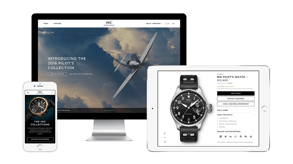
Problem: an app of silos

IWC Schaffhausen, a 150-year-old Swiss watchmaker, had a fragmented app. Campaigns lived in siloed microsites, the AR try-on was a disconnected novelty, and brand content like podcasts was buried instead of strengthening engagement.


The redesign aimed to reposition the app as a digital companion: a platform where customers could explore watches, engage with brand content, and transition seamlessly into commerce without losing IWC’s restrained elegance.

A lead funnel hiding in plain sight

Old App + Site

The old app: isolated campaigns, AR with no next step, hidden content

The old app: isolated campaigns, AR with no next step, hidden content

The old app: isolated campaigns, AR with no next step, hidden content

Mapping friction points

We ran a full UX audit of the app, pairing behavioral analytics with a review of content architecture and feature flows.


Key Findings


AR Try-On

High usage, but isolated from product and shop flows — more novelty than driver.


Campaign Microsites

Generated attention but disrupted navigation and continuity.


Podcast & Games

Hidden in secondary sections, with <5% engagement.


Operational Overhead

Each campaign required bespoke dev work due to a lack of reusable templates.

A lead funnel hiding in plain sight

We visualised the existing app journey to discover where users dropped off

Restructuring the IWC
content universe

Restructuring the IWC
content universe

Restructuring the IWC
content universe

We defined three CX principles to guide decisions:

Man Back Pose
Man Back Pose
Man Back Pose
Black Man
Black Man
Black Man
Black Man

01

Every piece of content should lead users toward a clear next step

Black Man
Black Man
Black Man
Black Man
Woman
Woman
Woman

02

Campaigns and layouts should rely on repeatable structures that scale for markets

Black Man
Black Man
Black Man
Woman
Woman
Woman
Woman

03

Content should reinforce, not compete with, product exploration

Black Man

Campaign-first vs. product-first

Campaign-first vs. product-first

Explored campaign-first vs. product-first layouts. We Introduced modular campaign templates with cinematic storytelling, AR try-on, and deep-links back to product display pages. We shipped the framework first with Top Gun and later reused it for Ingenieur.

Explored campaign-first vs. product-first home layouts to balance energy and clarity

Explored campaign-first vs. product-first home layouts to balance energy and clarity

Explored campaign-first vs. product-first home layouts to balance energy and clarity

AR try-on embedded within watch campaign pages

AR try-on embedded within watch campaign pages

AR try-on embedded within watch campaign pages

The same framework scaled effortlessly for Ingenieur

The same framework scaled effortlessly for Ingenieur

The same framework scaled effortlessly for Ingenieur

Watch Detail & AR Integration

AR try-on was rebuilt into the watch detail page. Users could now try a model on their wrist, then flow into specs, brand story, and purchase.

A lead funnel hiding in plain sight

Redesigned the AR flow into a complete path: try-on → product details → checkout

Redesigned the AR flow into a complete path: try-on → product details → checkout

Redesigned the AR flow into a complete path: try-on → product details → checkout

The AR wrist preview, optimised across devices, now directly linked to purchase

The AR wrist preview, optimised across devices, now directly linked to purchase

The AR wrist preview, optimised across devices, now directly linked to purchase

More
Work
More
Work
More
Work